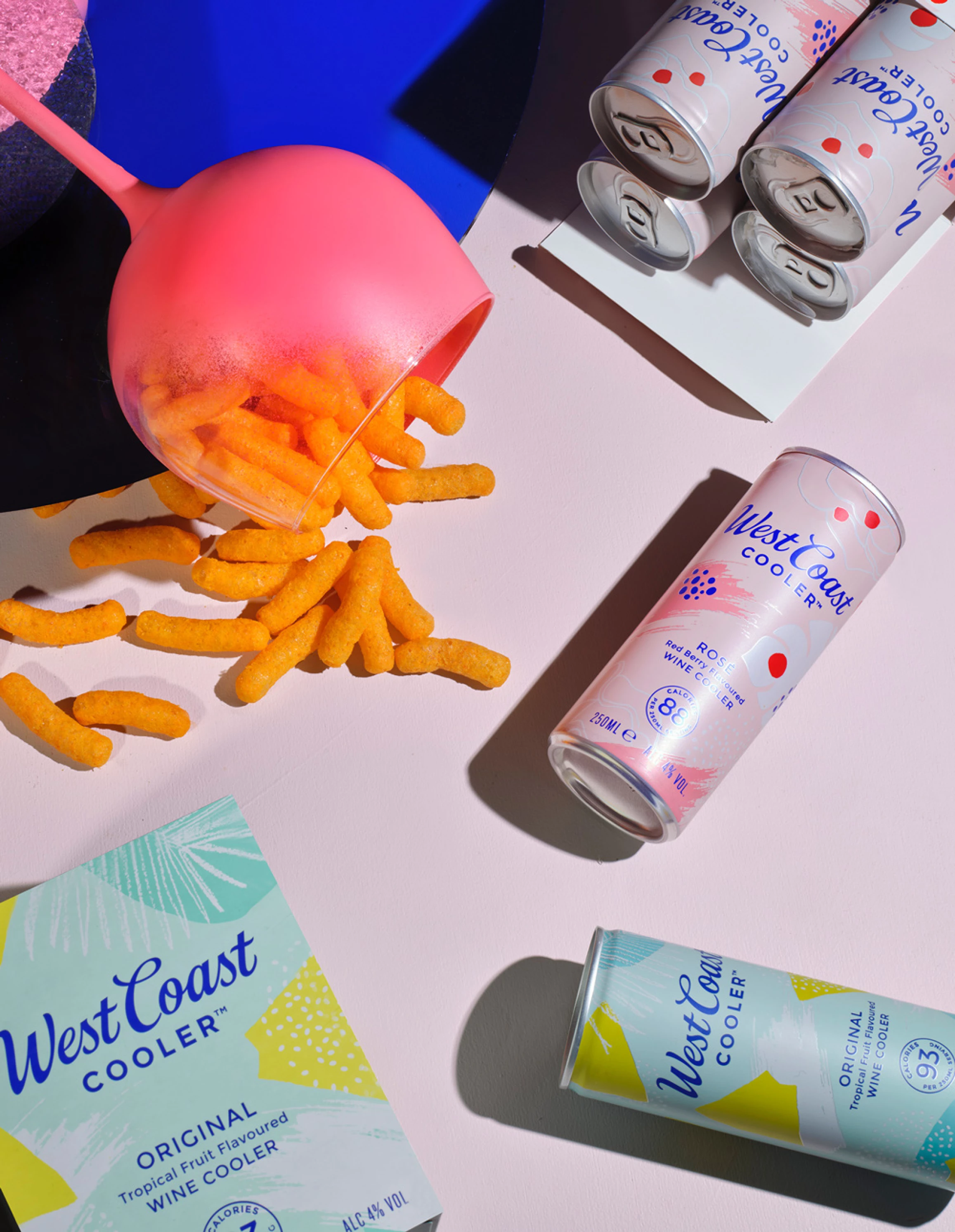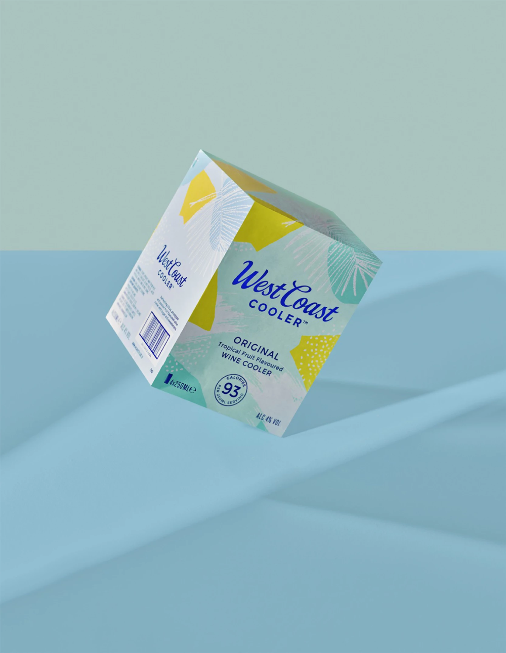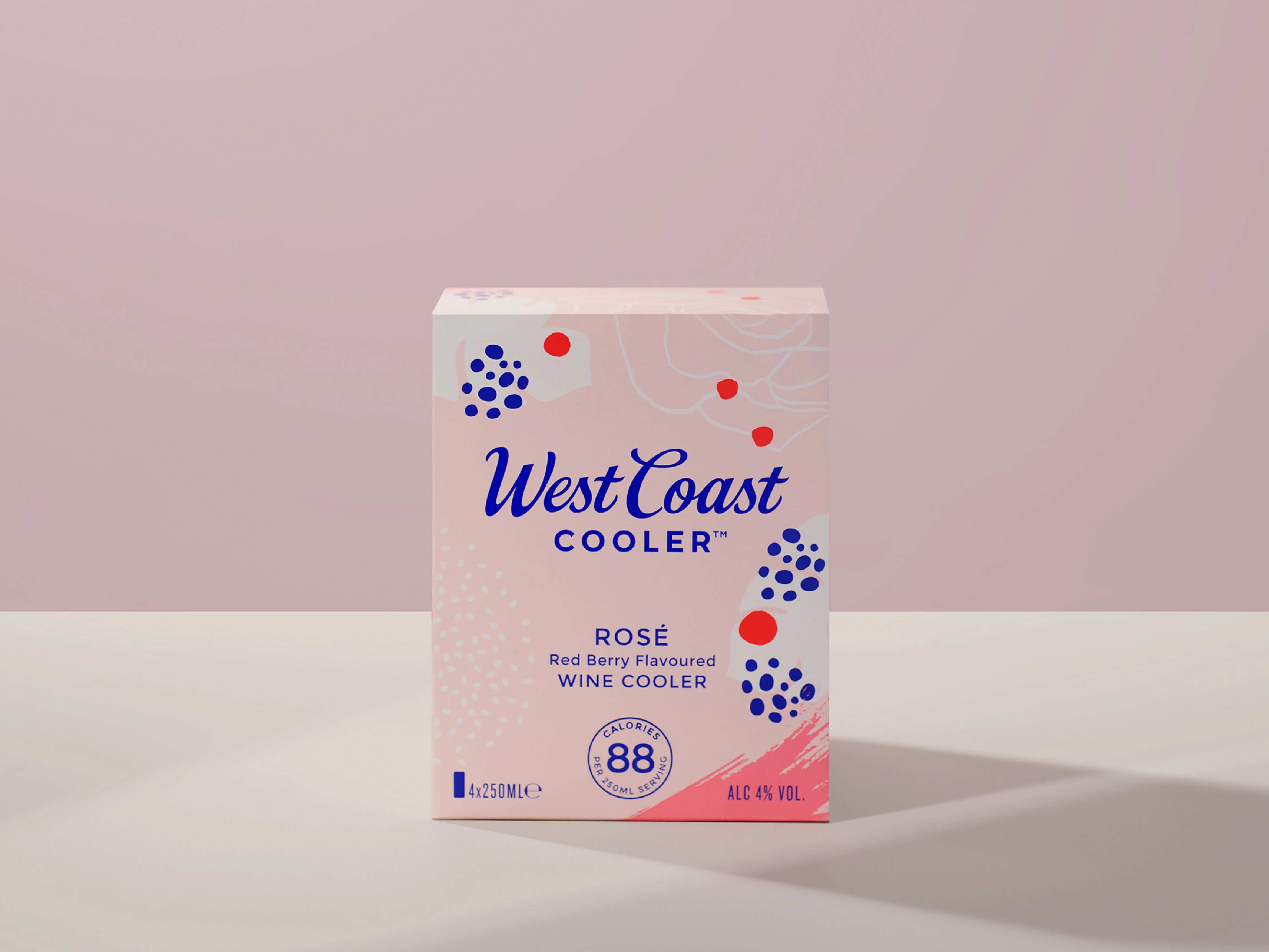
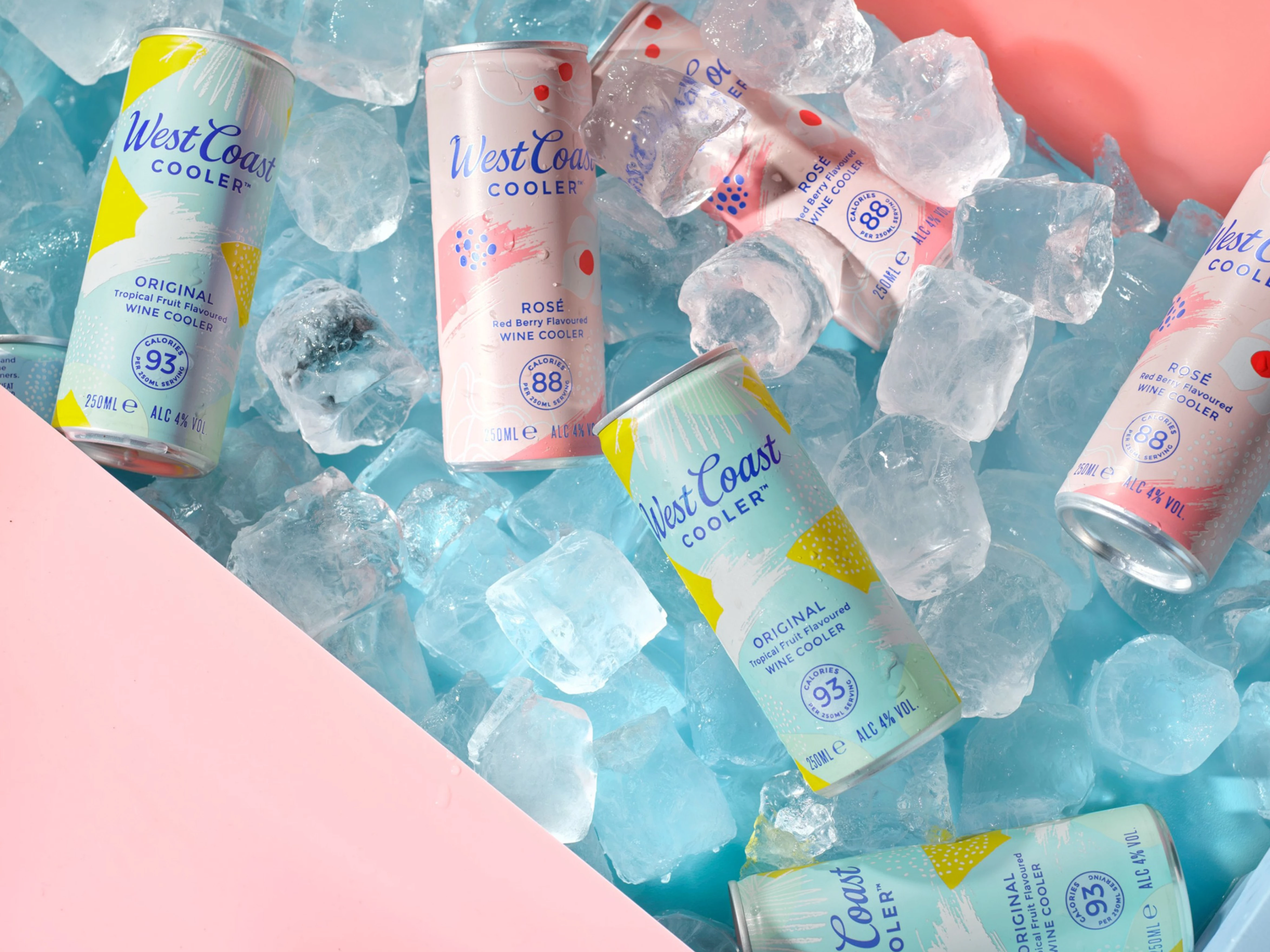
Irish Distillers approached us in 2020 to refresh a much loved Irish drinks brand, West Coast Cooler. With huge innovations in the ready to drink space, including the advent of the hard seltzer, West Coast Cooler needed a revamp to compete in this increasingly competitive space. The new look packaging needed to grab the attention of new shoppers, without alienating existing loyal customers. As part of the refresh a 250ml can format was introduced, a great opportunity to showcase the refreshed look.
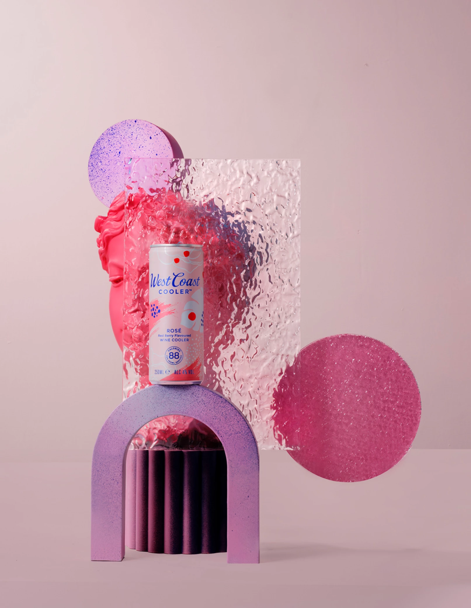
Carefree bubbly
WAVES OF REFRESHMENT
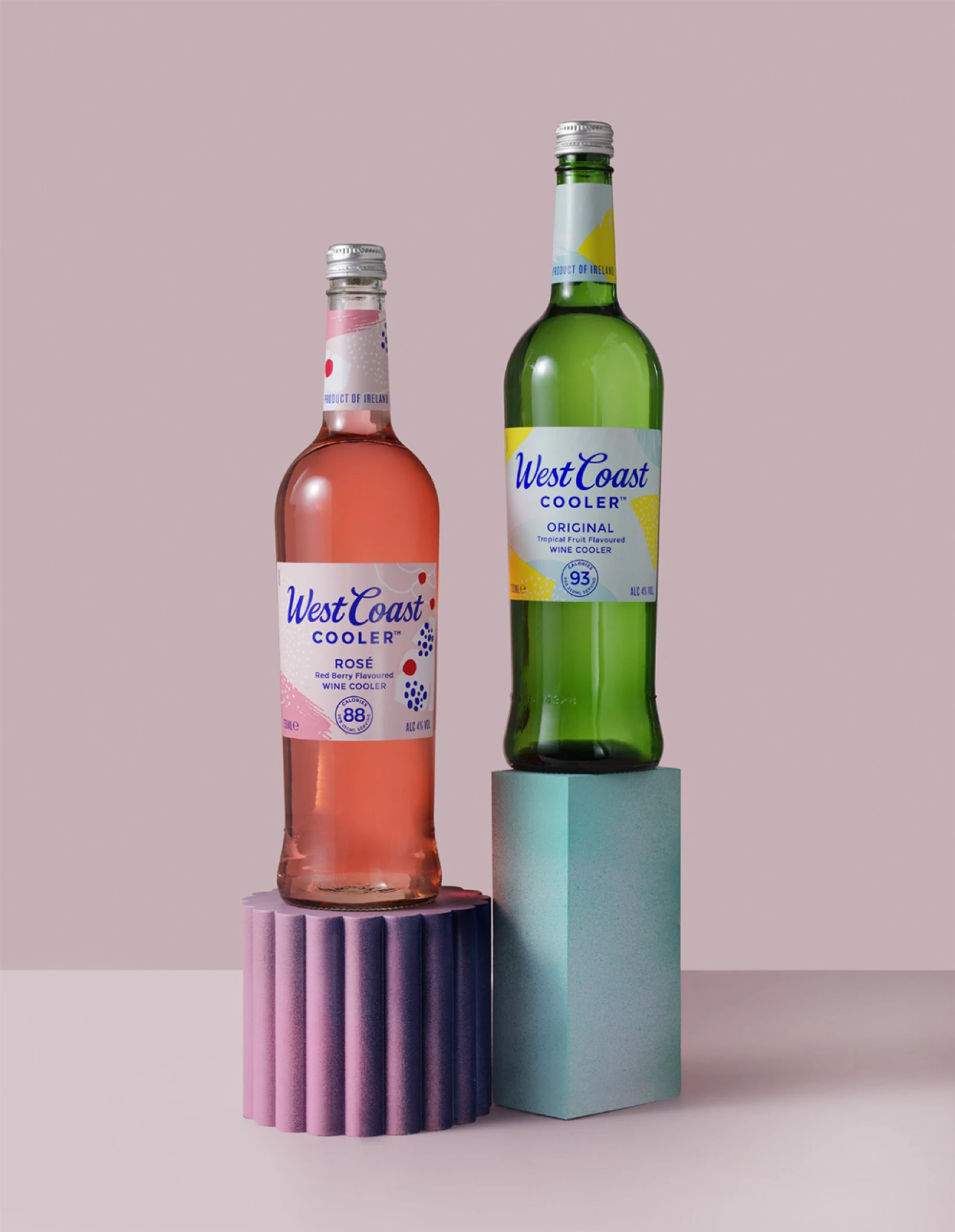
We wanted the packs to feel light and refreshing. West Coast Cooler is low in calories and lower in alcohol than some competitors, big positives for today’s more health conscious drinker.
COOLER SINCE 1984
Our research took us back to the 1980s when the wine cooler was born. A decade that didn’t take itself too seriously, there was a care-freeness to the 80s that we wanted to re-inject into the West Coast Cooler brand. Visual references from pop culture, music and fashion of the decade inspired the illustration style and pastel palette with an injection of electric blue.