Tula

A fresh look at fast casual

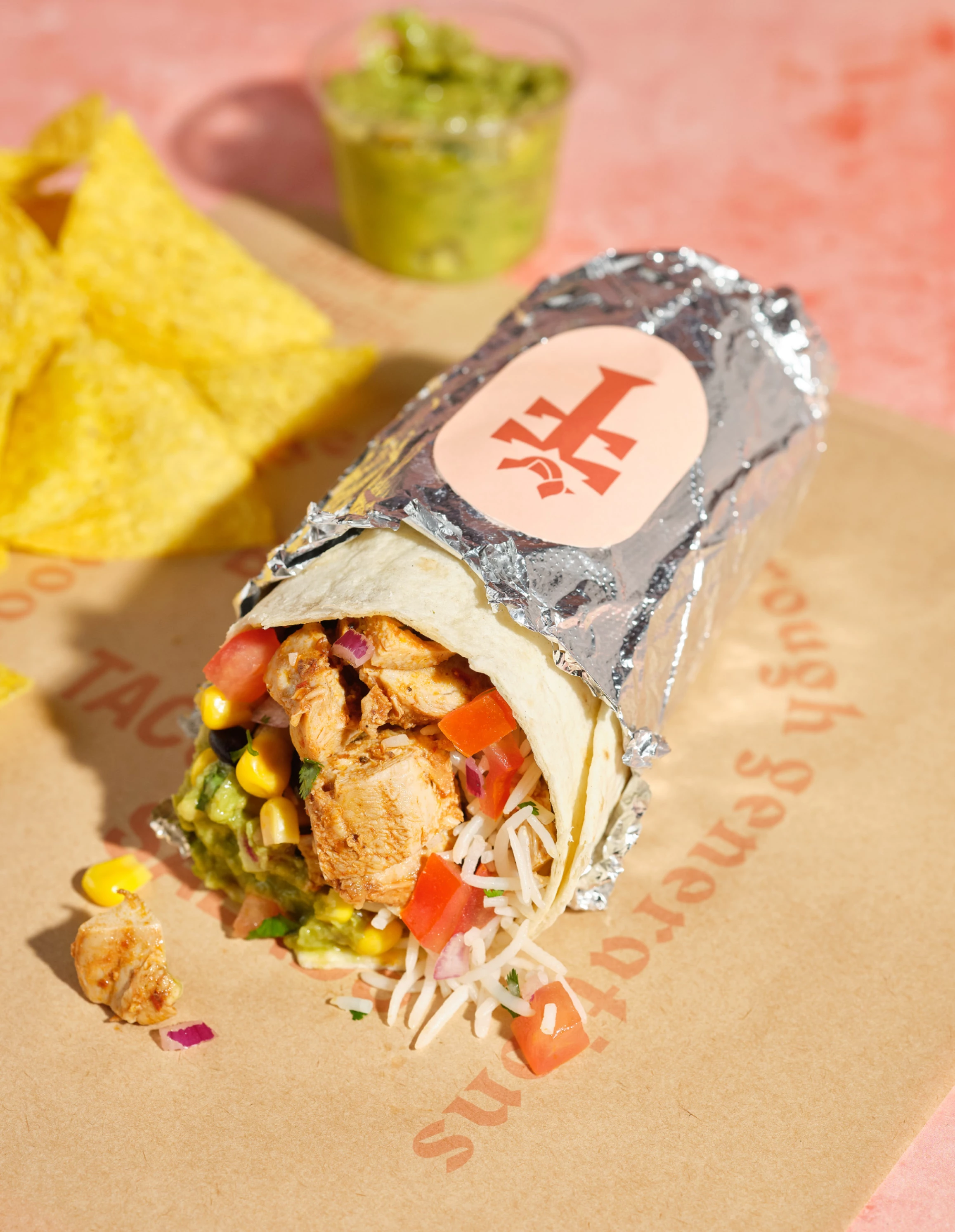
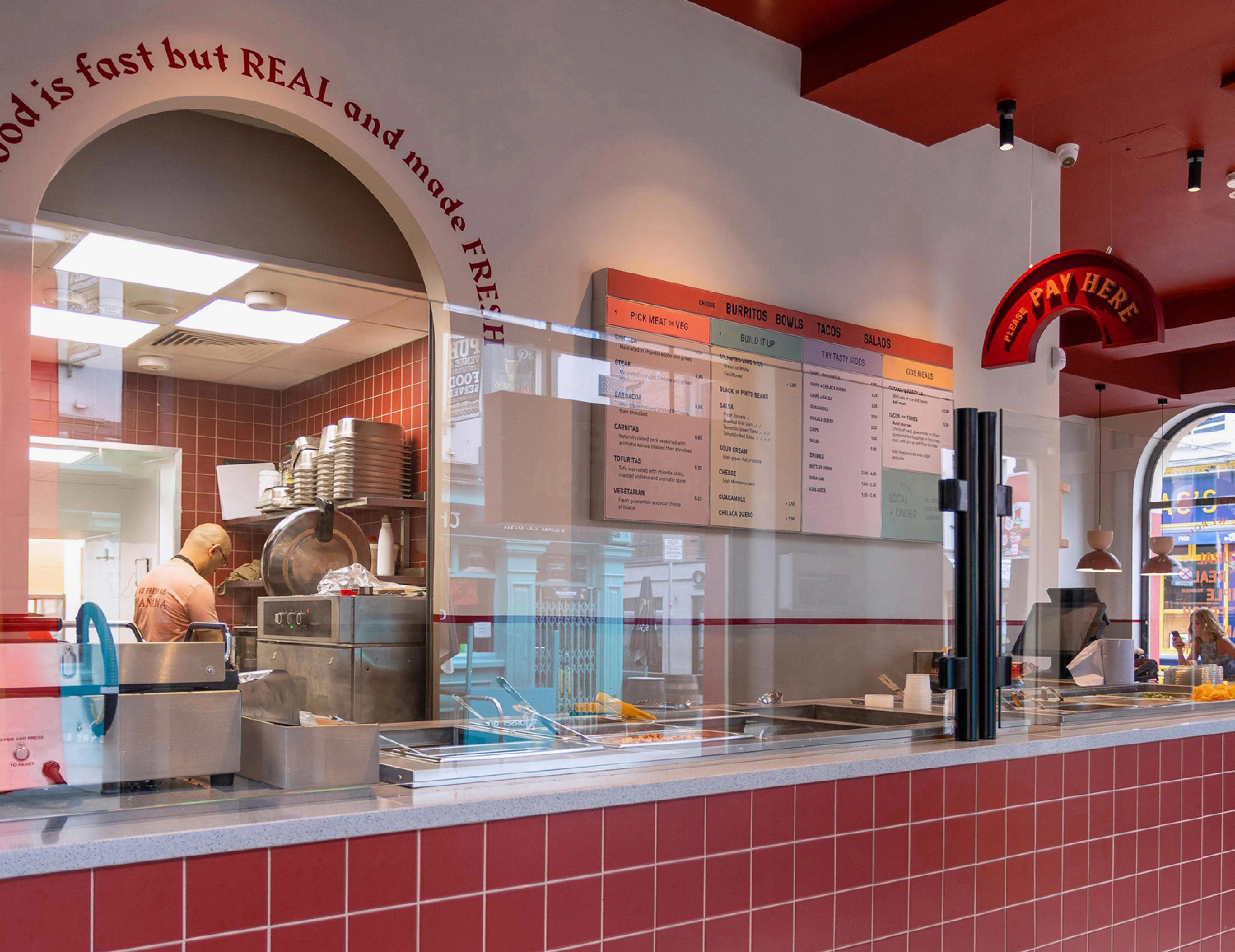
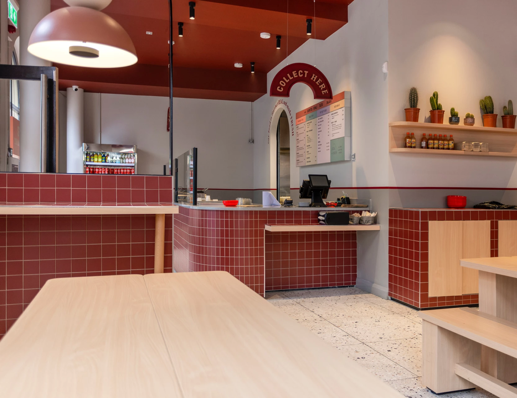
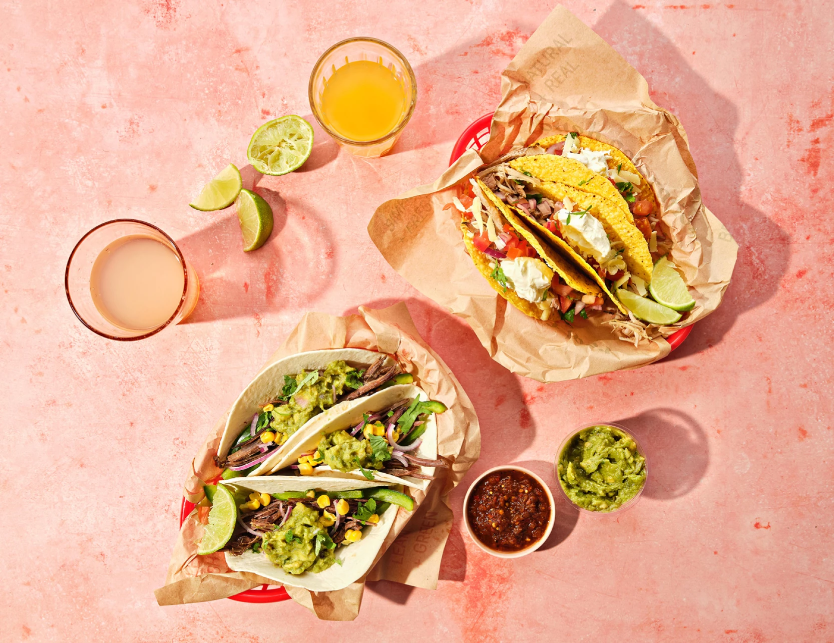
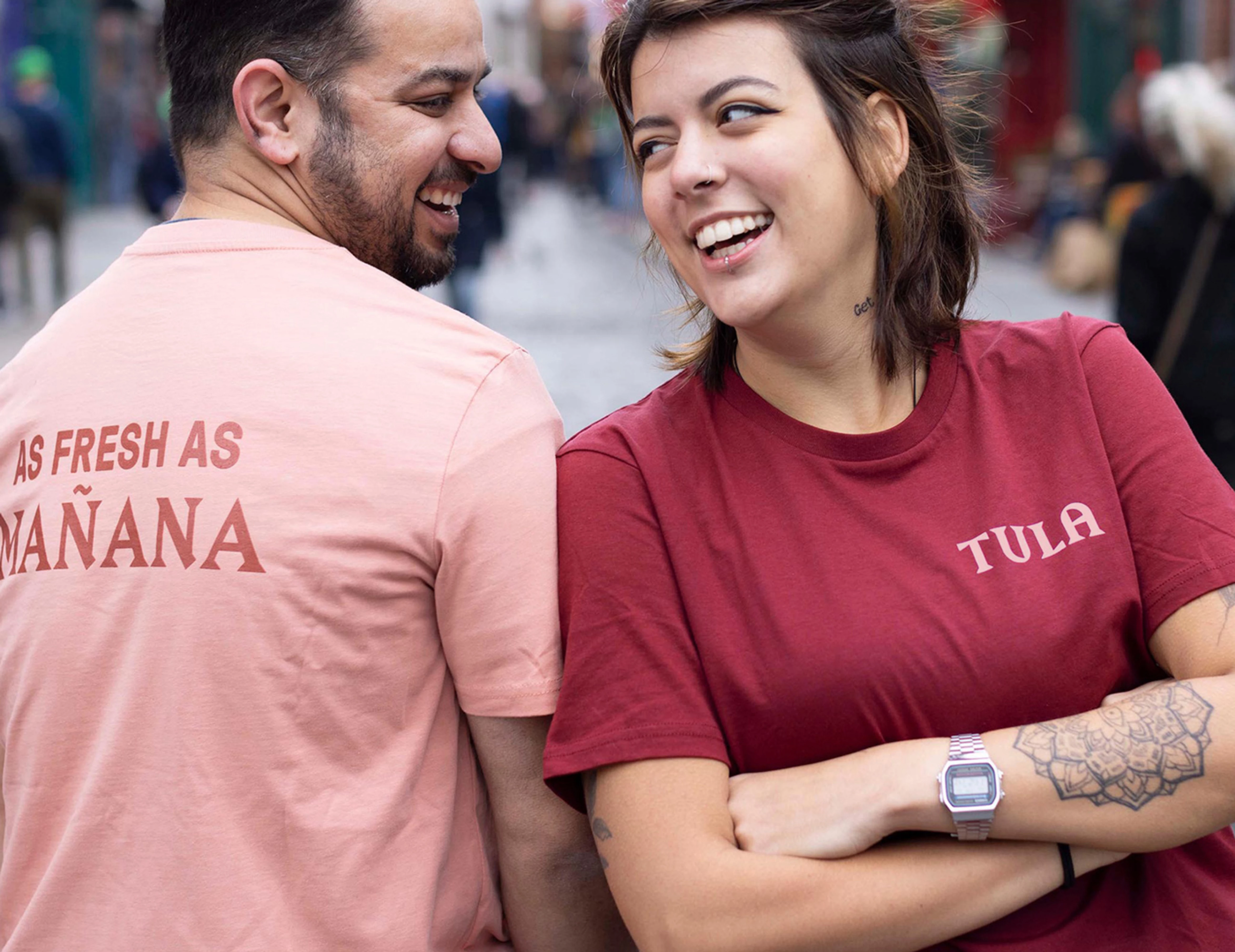
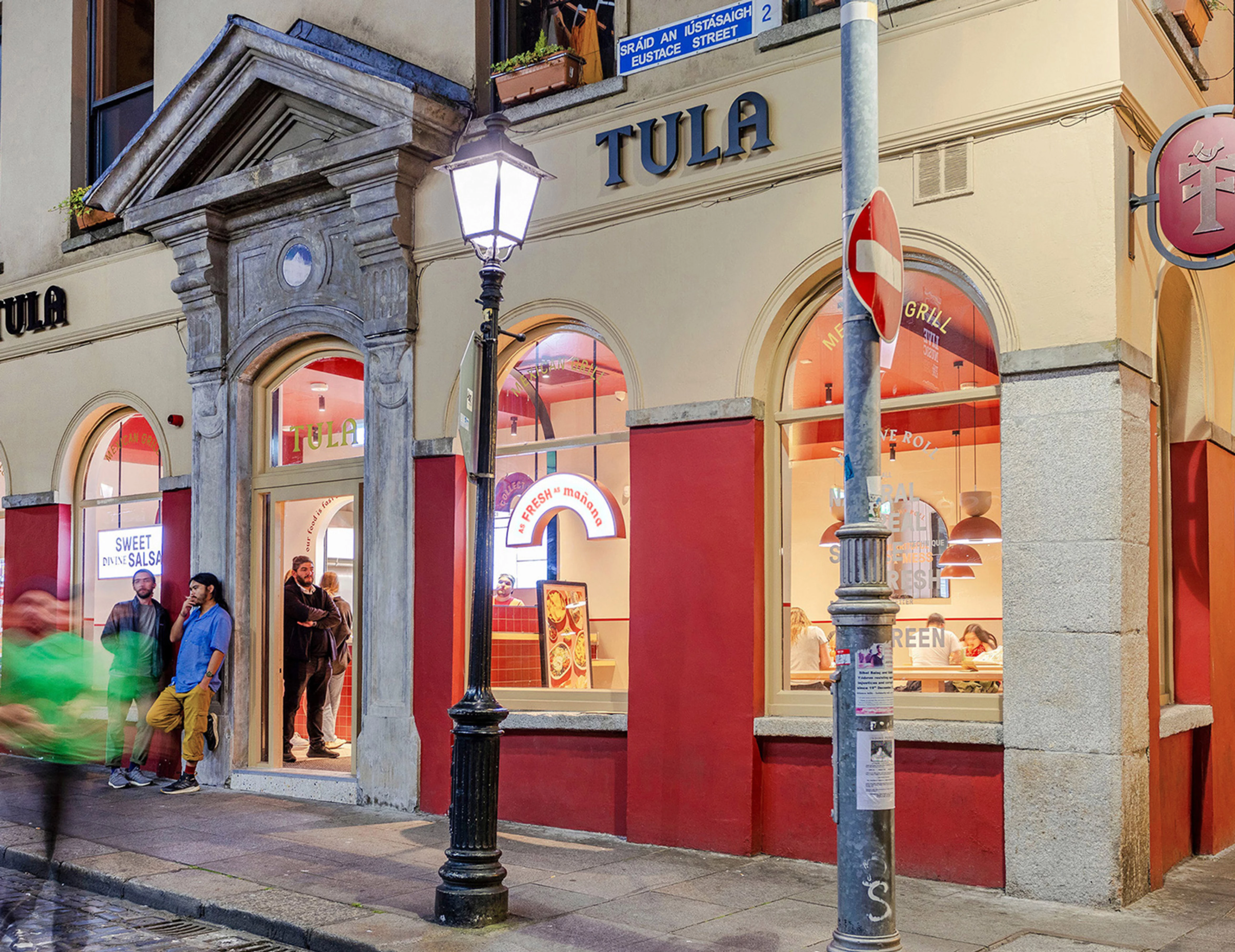
Tula was inspired by a passion for the burrito and the Cali-Mex taste, while partnering with local Irish producers - essentially seeking to nurture a better world through our bellies. The stores, while serving fast casual food, invite you to find a calm moment in a contemporary space to enjoy it too. Tula needed an identity that captured their essence, celebrated their food and complemented their interiors; an identity that would work across a chain.

Going back to the roots

INSPIRATION

Tula pride themselves on being focussed on delivering fresh and delicious food, fast. Going back to the origins of this street food, the Mexican tree of life influenced the development of the ’T’ emblem, creating a distinct asset and signpost. This ancient symbol is originally rooted in ideas of evolving life cycles, fresh beginnings, and replenishment that are fitting with the Tula values.

Setting the tone

A soft fuse of earthy pink and red tones make up the brand palette to marry with the interior style and create a warm, unified space. ‘Real’ food photography captures the food as it is meant to be sampled and enjoyed - getting stuck into rich, layered, messy, colourful spreads.

How we roll: Establishing the personality of the experience

Drawing on the casual nature of the food, a black letter inspired font was chosen as a nod to Hispanic street culture and vendors and for its interesting combination of arches and angles that mirror the store design. A play with layering fonts and language help to capture the enthusiasm that make this casual everyday bite an occasion to be relished.

What we did

  • Naming
  • Brand Identity
  • Tone of Voice
  • Signage
  • Environmental Graphics
  • Social Animations
  • Packaging
  • Food Photography

Collaborators

Interiors
21 Spaces

Food Photography
Jo Murphy

Signage

Academy Signs

Related projects